
The color of the year is carefully decided upon by The Pantone Color Institute after consideration and thought regarding current trends and influences. As a result, the Pantone Color of the Year subsequently influences future trends in design, including those of interior design and fine art. This year especially, it’s easy to see how much care has been taken to reflect on global and cultural influence on color and it’s impact.
And so we are introduced to the 2023 Color of the Year: Viva Magenta. A color so deeply rooted in cultural and natural inspiration its easy to see it’s influences. Whether we reflect to the fashion of popular figures such as Florence Pugh and Zendaya who have been seen multiple times recently in head to toe Magenta looks. Or look to influences of nature specifically pigments like carmine which produces a rich and bright red, which Viva Magenta heavily reflects.
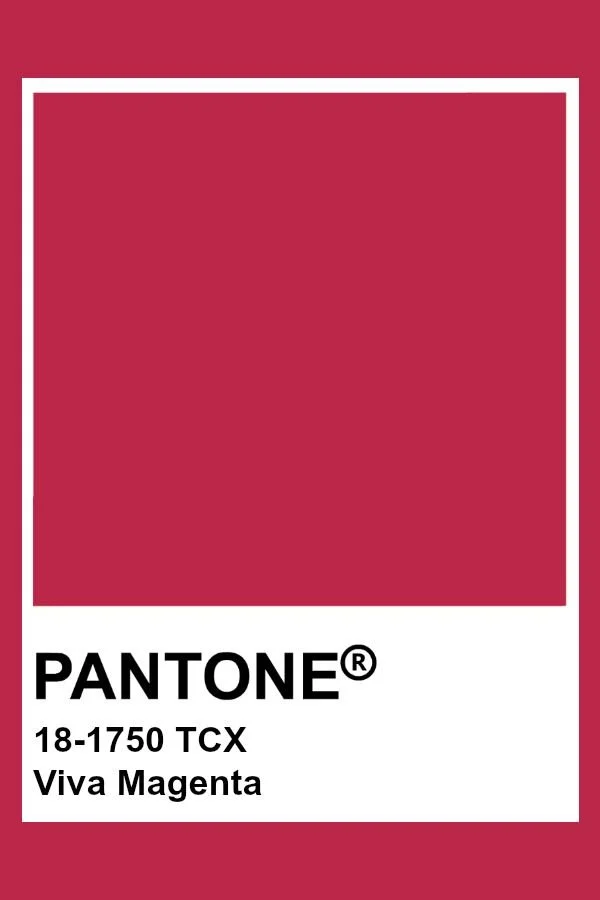
According to Pantone, “This year’s Color of The Year is powerful and empowering. It is an animated red that revels in pure joy, encouraging experimentation and self-expression without restraint, an electrifying, and a boundless shade that is manifesting as a stand-out statement. PANTONE 18-1750 Viva Magenta welcomes anyone and everyone with the same verve for life and rebellious spirit. It is a color that is audacious, full of wit and inclusive of all.”
Continue reading to see how we’ve explored some of the endless possibilities Viva Magenta has to offer when it comes to interior design and incorporating fine art into your collection.


